These are the details, minus assignment information, to the section of Typography 1 taught by John McVey in Spring 2018.
Meets Monday and Wednesday, 3:30-6:10, in H-206/7.
course description
GD 212 Typography 1 (3 credits)
An intensive introduction to the fundamentals of the manipulation and management of type, from individual letterforms to large bodies of textual information, for digital and paper platforms. Attention to formal, technological, rhetorical, and historical issues. While the focus is on page layout and vector graphics programs, the school’s letterpress facilities may also be employed.
Fulfills: Lens, Technology and Time Elective; Typography I Requirement (Graphic Design and Illustration students); Studio Elective
elaboration —
- Formal : look, structure, organizational.
- Technological : the tools (primarily InDesign CC).
- Rhetorical : meaning, how looks
frame
or characterize a message; appropriateness.
- Historical : as historical issues/points/parallels etc. come up.
- Good form relates both to looks and behavior/etiquette (appropriateness).
If the instructor has a bias, it is to usage of type on the page, over the design of letterforms in detail. However, both are about structure, and both are addressed.
The class might be described as a mix of 2D (foundation level) and publication design. We will also spend some time working with lead type (a collaborative broadside) and at least think about intersections with design for screen devices. There is some conceptual overlap with what goes on in Web Authoring 1, with regard to specification of design elements (so that like elements behave similarly throughout a page and document).
course objectives
- get grounding in typographic design principles
- form/structure: honors and facilitates engagement with content
- macro : composition / grid-based layout, sequencing
- micro : character and line spacing (via specification of paragraph and character
styles
) - ability to work in expressionistic and engineering modes
- genres (books, documents, prose/poetry, etc)
- gain familiarity with features of type in different classifications
- and judicious selection of typefaces/styles, for particular purposes
competencies
Competencies
means, what students should expect themselves, and be expected by others, to know or be able to do, upon completion of a course. They are related to the course objectives listed immediately above, but are generally more specific.
Because they are more specific, it is reasonable to suppose that they are subject to change from year to year, as technology, genres, curriculum all evolve. In this class, most (and even all) exercises come with a list of objectives. Those various respective objectives add up to the competencies associated with this course.
expectations. criteria for credit
It is your expectation that learning happens in this class, and it is mine. Where it’s not happening to the degree it should be, we make adjustments.
Physical and mental attendance required. Do and think about the readings; think about and do the exercises, writing. Participate, bring what you know (and don’t know, your questions) into the conversation. Do this and you’ll be all right.
Excessive absences, or silences, or latenesses, or nothing to show, will affect your grade.
It has not so far been my practice to grade every assignment. Instead, I review everyone’s full output at the end of the semester, and adjust my cumulative thinking at that time. However, I may grade some larger projects, whose spirit and objectives exceed those of the experimental exercises.
It is an absolute commitment of this instructor to make Seminar a good experience for everyone. If you anticipate that you have learning differences that could be a challenge, see or contact the College’s Writing Studio and/or its Disability Services Office, both on the second floor of 248 Cabot Street.
academic-advising-and-support/
I want everyone to have a success — and a good, lasting experience — with typography in this class. I am happy to meet individually with anyone where there are challenges to address; if you are registered with the Disability Services Office and approved to use accommodations, we can discuss what those could mean for this class. We’ll make it work. I am often adjusting project parameters, based on issues that arise, and naturally do so to accommodate the needs and situations of individual students, consistent with our shared common objective, which is learning.
I have maintained websites for this class in the past; they can be found (with some visual examples) via the Design program website.
readings
Carolina de Bartolo (with Stephen Coles and Erik Spiekermann). Explorations in Typography (2016)
explorationsintypography.com
Cyrus Highsmith. Inside Paragraphs (2012)
Sandee Cohen. InDesign CS6 (Visual Quickstart Guide, for Macintosh and Windows). Peachpit Press, 2012 — highly recommended
Cyrus Highsmith. Inside Paragraphs : typographic fundamentals (2012) — probably required
other —
Adobe Font Folio 11, Type Reference Guide — will distribute part of this
Ellen Lupton. Thinking with Type, 2nd edition. New York: Princeton Architectural Press, 2010 — recommended
Robert Bringhurst. The Elements of Typographic Style (Fourth edition). Hartley & Marks, 2012. — classic, not experimental.
Erik Spiekermann. Stop Stealing Sheep & find out how type works, 3rd edition. Adobe/Peachpit, 2014 — recommended
Peter Dawson. The Field Guide to Typography : Typefaces in the Urban Landscape. Prestel, 2013 — recommended (am contemplating assigning this text)
Keep abreast of the design blogosphere (Design Observer, GrainEdit, etc.). Please also keep an eye on magazines that emphasize typography, such as Baseline and Eye, which are available in the Montserrat Library.
Finally, the instructor maintains bookmarks on design related anythings at pinboard.in/u:disegno.
side note —
Use fonts from the Adobe Fonts Folio (via FontBook, stored on Working Volume).
If using a web font, test test test.
an excellent resource : Butterick’s Practical Typography.

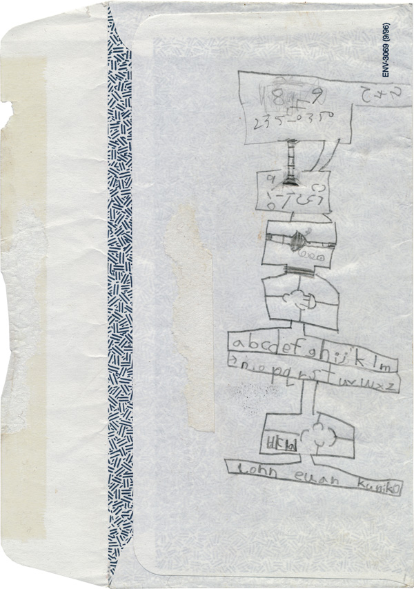
| Alphanumeric character transmuter; Euan McVey, ca 1997. |
|||
Project information and visual examples at main course page.
description
objectives
competencies
expectations / criteria for credit
readings
bookmarks on design related anythings at pinboard.in/u:disegno.
montserrat design tumblr
Comments/questions to john.mcvey.