montserrat design
design senior projects, ca 1998-2020
2010 < 2011 > 2012 course blogs : spring 11
 |
 |
 |
Jonathan Brown Sarah Carroll-Coelho Zarah Cinarli |
 |
 |
 |
Rick DeCosta Alexandra Fiore Ariel Heinemann |
 |
 |
 |
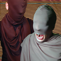
Tessa Magnuson Lindsey Mason Autumn Murphy |
 |
 |
 |
Jennifer (O’Brien) DiBiasio Kellie O’Hara Jordan Pomazon |
- Jonathan Brown
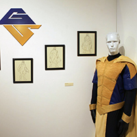
Gilded SentrySuperhero costume development — concept, origin story; boots; logo/symbol; suit
blog posts —
Spring 2011 - Sarah Carroll-Coelho
Dissection in a SquareAn exploration of my personal style of work as a graphic designer. emphasis on line and space, reliance on grid structures. Dissection in a square is a breakdown of the architectural images that I have taken of various buildings in the Boston area. using those images, abstract marks were created rom the lines and shapes visible in the structure. I used architectural model making materials like foam board, needles and string to then create three-dimensional structures.
blog posts —
Spring 2011current —
behance - Zarah Cinarli
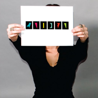
The Loss of InnocenceDevelopment of a symbolic typeface, conveying a “language of meaning.”
Two versions: one “that was overly detailed and looked more like ancient writing” and the other less detailed, “inspired from the newer more recognizable sans-serif typefaces like Helvetica.”earlier idea :
showing dreams and questioning why we have the need to interpret them.blog posts —
Spring 2011current —
zarahcinarli.com (product designer, now freelance) - Rick DeCosta
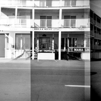
Hampton BeachHampton Beach
photographic essay, in three volumes :
the strip, found lettering, derived lettering
(all accompanied by John Greenleaf Whittier, his poem about Hampton Beach (The sunlight glitters keen and bright...)....for one of my projects I had actully made a mistake with the Holga camera by not advancing the film enough. Though it was a mistake, it was a really good one. I was able to get a panoramic/double exposure view of the scene I was taking... I could perform this mistake along the whole strip...
current —
rickdecosta.com - Alexandra Fiore
ZANDRA : The Mixed Media MagazineZANDRA has been a goal of mine because of my interest in editorial design. I created ZANDRA with the intention to fulfill all of the different roles it takes to create a quarterly magazine... founder, art director, editor, copywriter, designer, model, and production artist.
blog posts —
Spring 2011 - Ariel Heinemann
Naughty Dog (Spring 2011), A Girl Named Otis (Fall 2010)A Girl Named Otis
development of a brewery concept, identity, etc.
Naughty Dog
extension of the Fall project, to include dog collars, kids t-shirts, baby clothing, wine bags, bandanas, etc.blog posts —
Spring 2011current —
linkedin - Tessa Magnuson
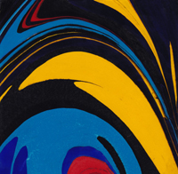
DigestionDigestion
To take into the mind or memory; especially : to assimilate mentallydocumentation headings :
semester 1
rhythm, focal point/emphasis, balance; stimulus overload; constraints; chance; Ode to Ellsworth Kelly; visions;machineidea; topographic square dance; constant connection; waste; materials used for altering a dictionary; six and a half inches; the collection is dead; enlargements; untitled anomalies; lists; existential listmaking; public/private; digestion
semester 2
rebuilding : visions, no dice, public/private; collateral anatomies; new works : need more/want more; family portraits; 2800 people like this; Me, Me, Me; Dear Mrs. Albersblog posts —
Spring 2011current —
Align Graphic Design - Lindsey Mason
obscurities1
machines; deconstruction of machines (sewing machine; typewriter); isolation and repurposing of machine parts; dance
2
The Work : Wet Shoots; The Work: Metal Extensions; The Work: Characters (The Virgin, The Monk, The Spectator, The Temptress, The Criminal, The Murmurs; The Idiot, The Young Man.image : postcards (draft)
blog posts —
Spring 2011current —
lindseymason.com - Autumn Murphy
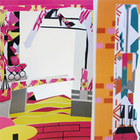
When Red Meets WhiteRetail store lookbooks
The idea of showcasing how I felt when I walked through a store, through the books. The chaos, the urge to buy everything and the anxiety.
I started out doing literal interpretations of what a store would like like, and over time created look books with each store.
Each store had a theme and different patterns and colors that added to the feel of the lookbooks.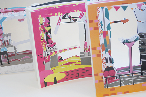
Autumn Murphy’s When Red Meets White combines her two favorite things: shopping, and the color pink. Working from the real life experience of being a consumer in the retail market, Autumn set out to create eye-popping patterns that would pull in viewers. “When I see something I want — I buy it. I can convince myself to buy anything.”
whenredmeetswhite.tumblr.comblog posts —
Spring 2011 - Jennifer (O’Brien) DiBiasio
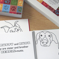
Breedism, Abuse and CompanionshipBased on the success stories of rescue dogs I came in contact with... I feel like children have more exposure to pure breed “designer” dogs and the dogs which I have been using in the coloring books cannot be pinned down to one breed — they are all mutts. I want to expose [children] to the concept of animals shelters while using the coloring books to teach them the responsibility of owning a pet, showing them that each dog has its own personality and habits that you sometimes can’t break them of...
also
giveaway bags... which contain promotional/informational materials from local animal shelters. I have put together about 300 of these for people to take for free during my show.formats —
posters, coloring booksblog posts —
Spring 2011current —
Graphic Communications instructor, Diman Regional Vocational Technical High School
behance
linkedin - Kellie O’Hara
layering repetitionformats —
paper, cutting, folding, curling, sculpting; transparences, vellum; shadows; backlighting
an image of a map that I was attracted to and decided I wanted to use it in my entire body of work
embossing...blog posts —
Spring 2011current —
linkedin
kellieoh.com - Jordan Pomazon
I An Overrated Sense of Sense
II The Wry, Raw, Whimsical WallAn interactive exploration into context and sarcastic dickery
conclusion of exercise (in gallery show) : 50 (iconic/illustrative) images, and 100 captions (taken at random from local newspaper); viewers could juxtapose these, to consider the resultant combinatory meanings (if any).
selected captions :
Trying to fit a square peg in a round hole
Break every ten minutes
Mostly devoid of poetic whimsies
The Drugs don’t workblog posts —
Spring 2011current —
jrpomazon.com
sometime drawbridge operator, barista, library page... poet.
linkedin