kind of a non sequitur

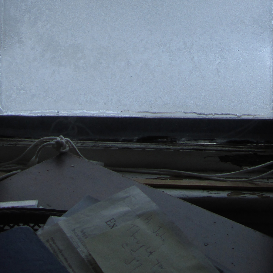
snow beyond, 20 January 2019
foreground paper, cover note to Rob Walker, “The Expensive Type / Why so many luxury fashion logos are choosing simplicity over standing out” in Bloomberg “Pursuits” (November 26, 2018)
same article, different title, here
Luxury typography is kind of a non sequitur.
— Peter Saville
tags: frost; non sequitur; tone; typography; windows; Peter Saville